Off piste.

It’s raining. Again. Hello Autumn. The mornings are now dark, the weather less inviting and the heating is cranking up. Time to hunker down, and a time that is naturally more introspective. I’ve got a couple of technical projects on the go at the moment – lots of detail and tiny hand flicks, so I’m using the Instagram #Inktober prompts to keep my mind working in different directions, my hands relaxed and go off piste. 

fig.1: #Inktober2019 “Husky”

fig.1: #Inktober2019 “Husky”

So far I’ve done a couple of pieces, but one prompt – “husky”, threw up this image [fig.1], the word spinning through random associations till coming to rest on the quality of a voice, which took me to Paul Robeson, whose amazing voice my father listens to for moments of solace as his dementia takes away more and more. In the image Paul is singing ‘Joe Hill’ to miners at Woolmet Colliery, and I wanted to use coloured inks to bring out the rise and fall of the song, and the different qualities of the voice. Dad filmed Robeson’s performance for an episode of Mining Review (you can read more about that here https://www.bfi.org.uk/news-opinion/news-bfi/interviews/paul-robeson-coal-mine), though I wonder how much now the tone, and deep feeling of the singing means more than the original memories that anchored his love for the songs.

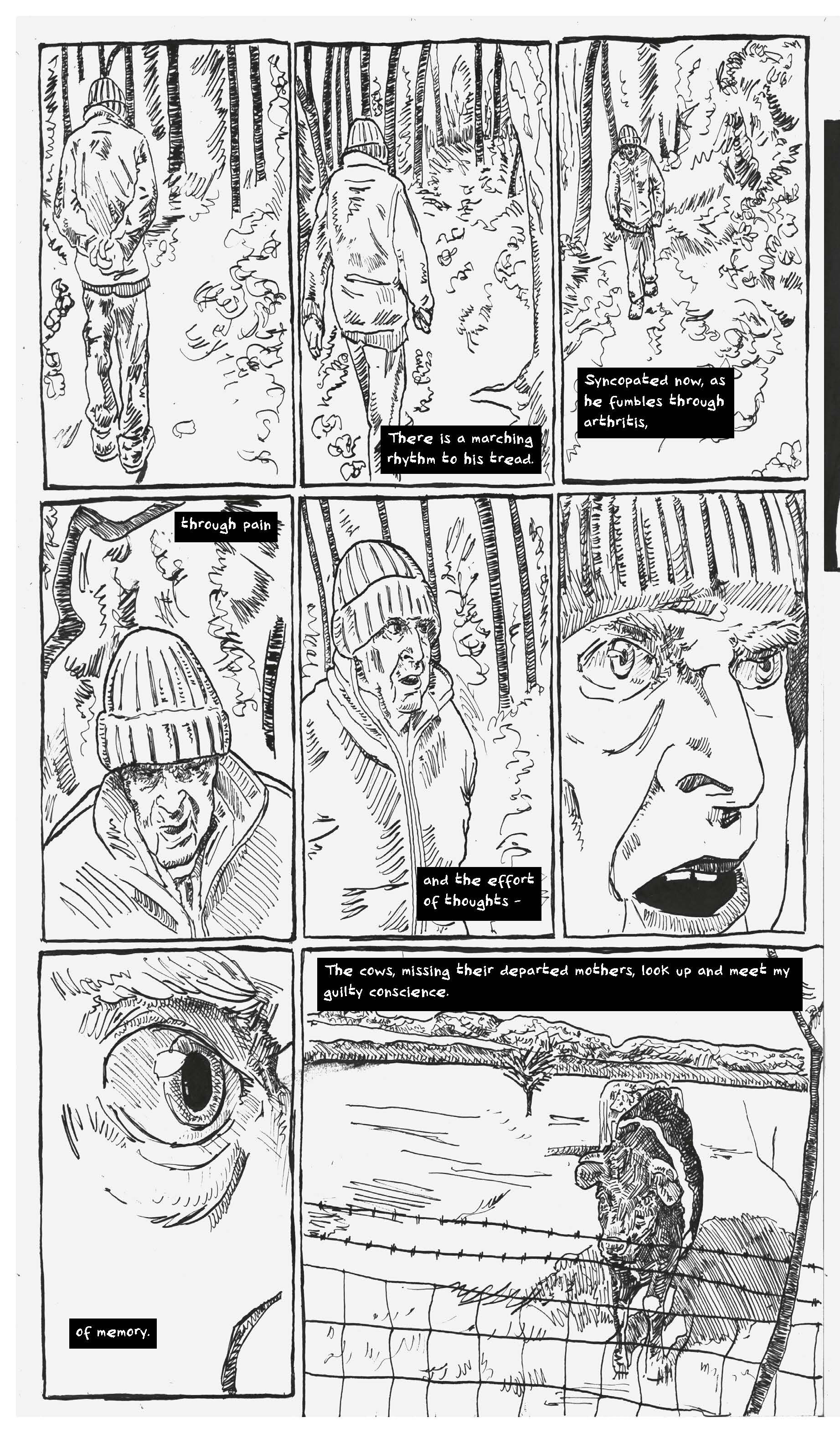
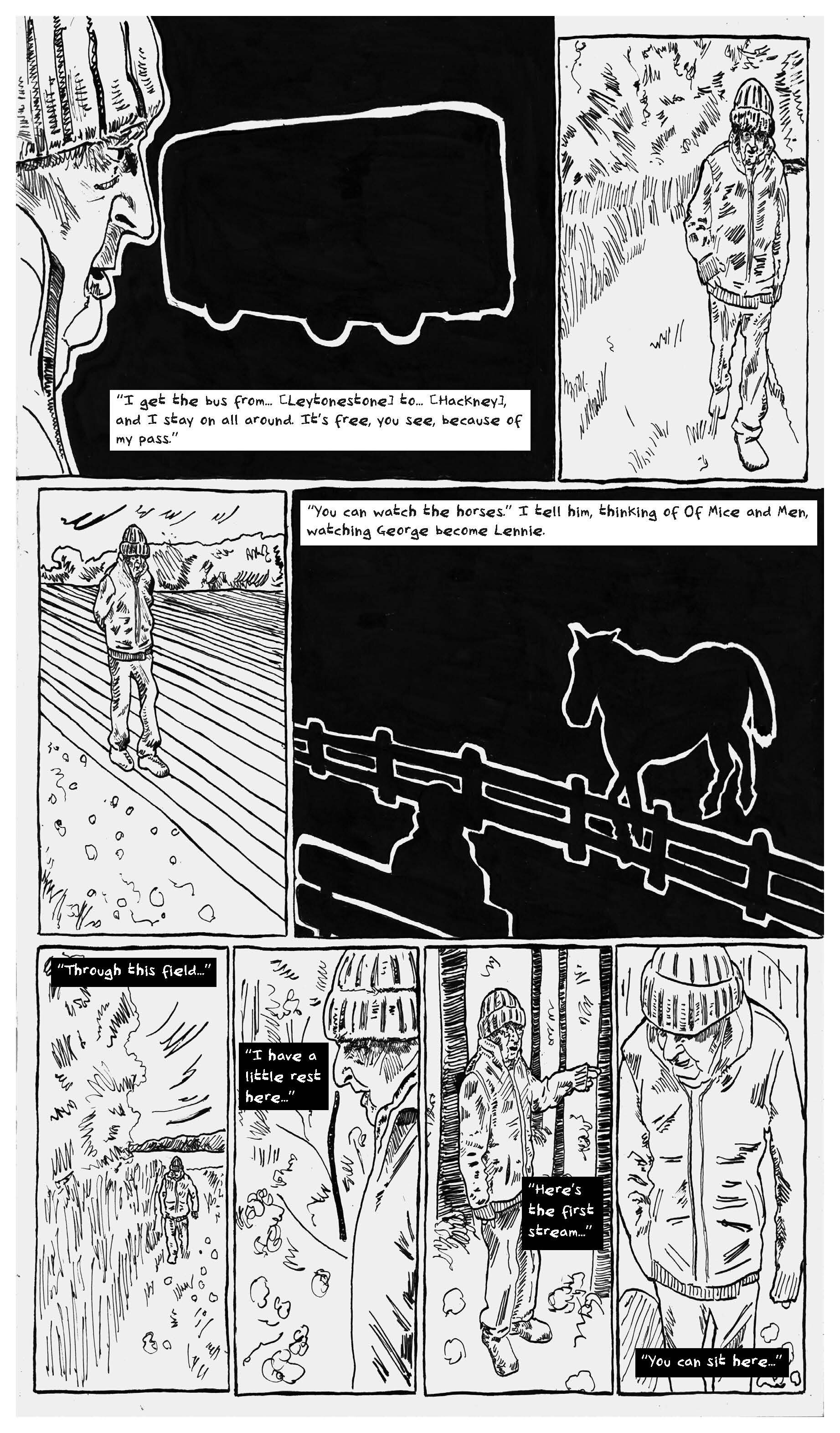
On that note, I’m giving the rest of the blog over to a graphic short story I drew last year about the moment we decided Dad would have to move into care… “The Decision”…

fig.2: The Decision pg.1

fig.2: The Decision pg.1

fig.3: The Decision pg.2

fig.3: The Decision pg.2

fig.4: The Decision pg.3

fig.4: The Decision pg.3

fig.5: The Decision pg.4
fig.5: The Decision pg.4

Story design.

One of my favourite forms of drawing is thumbnailing. This might be for a narrative comic, or as a stepping-stone from quick sketching to a realised composition, but whatever the purpose I often feel Thumbnails are some of my best work. 

I love the challenge they provide because at the thumbnail stage all the willow-the-wisps of ideas and thoughts start to solidify and collide against each other. They begin with soft lines that lead to decisions about design and composition. These lines are deconstructing a narrative or a brief, starting to shape them within the space – whether that’s a page limit, a size or purpose. 

fig.1: “Romans” thumbnails.

fig.1: “Romans” thumbnails.

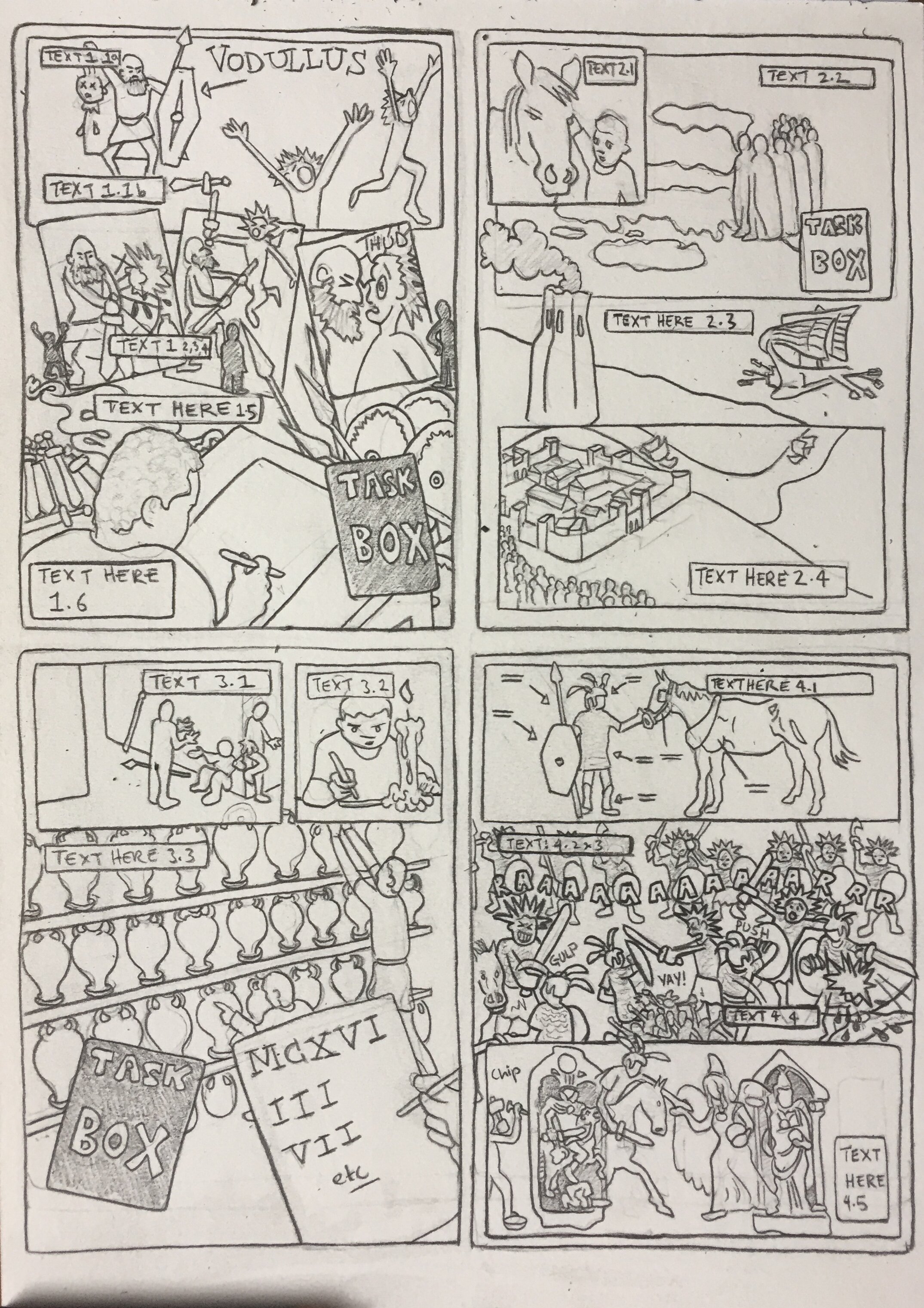
 For this post I’m going to talk about some recent thumbnails for a comic I’ve been working on [Fig.1] – so in this case the design is a form of choreography, of isolating narrative into beat of movement or gesture. Taking the script and purpose of the piece and establishing the key relationships: between the words and text; between the symbolism and the story; between the narrative and the reader; and internally between the characters and setting. 

My initial thoughts turned to the violence. Not going to lie, I loved working out the rhythm and gory detail of the fight sequences – deciding how to identify a different visual quality between the two sections. The sequence top left is more character focused, so uses multiple panels to hone-in on specific moments, whilst the other sequence bottom right has a more epic sweep, so I wanted to keep the beats ‘in-panel’ – kind of like the camera panning across a landscape on film. 

In contrast there were the moments of transition, and quiet interiors, which often need more specifics in terms of reference, and more thought in terms of the composition. I find that for these ‘quieter’ moments the key is working out the motivation of the characters and the emotional tone – what does the story need to communicate to the audience in these moments, and how can it be visualised? In this case moments of connection – top right where he meets his horse, and bottom left where the soldiers enjoy some down-time, and moments of introspection – bottom right where he writes by candle, all serve to bring out the humanity of the narrative arc, and build to the dénouement

 My drawing in thumbnails is generally more stylised – after all these are produced at a small scale (this whole page is a4), but it identifies where research is necessary, and gives an opportunity to apply that research to the needs of the story – working out objects, clothing and actions, that in turn feed into the design of characters and places. Of course, half the point of thumbnails is that they might be changed in collaboration (in whatever form that comes – possibly an author, maybe feed-back from a trusted reader), and I already know changes that will need to be made to these – including losing one of my favourite panels; but the act of putting together these thumbnails has created a rhythm and pattern to work to making the intangible tangible.

Rugby fever.

This needs to be quick – as the game is on soon. It’s the rugby world cup, and Wales start their campaign in a bit. I love Rugby Union, so after a weekend where I could overdose on matches, I wanted to celebrate the speed the strength, and the bloody-mindedness of the game.

fig.1: Rugby 1

fig.1: Rugby 1

 Also, with it being in Japan I, got to try out a brush pen I’ve had lying around for a while (typically these pens are associated with Manga), which it turns out gives a lovely flowing line which suggests movement really well. Though it took me a while to loosen up, and not try to do too much – often the case when trying out a new technique. Rugby Union is fascinating to illustrate because the players are sculptural – both beautiful and grotesque, and the game wraps moments of explosive action around strategic attrition. These drawings manipulate the amazing perspectives of the human body that Rugby displays - no-one makes these shapes naturally! The addition of colour suggests the energy of the game - whether in running free, committing to a tackle, or pushing, what seems like endlessly, in a scrum. I hope the lines also show the humanity of the players, who can easily be mistaken for icons, or avatars.

fig.2: Rugby 2

fig.2: Rugby 2

 One of the surprising things about me, if you know me, is that I’m a passionate rugby fan, and in particular Wales (long story – but it’s a thing now). It’s surprising cos’ I really don’t look like someone who’s into sports – never-mind who plays it – which I don’t generally. But for a few months in sixth form I did. I was rubbish – no, really. I’m 5’ 11” on a good day, back then I was skinny, I am really short sighted, didn’t have contact lenses, and I played second row… (*ahem, this pause is for rugby fans to finish laughing, for those not familiar – a normal second row is seventeen feet high and built like a brick shit house… okay, slight exaggeration, but you get the point… competing against them was fun).

fig.3: Rugby 3

fig.3: Rugby 3

 The thing is though – I played. The team found a space for me, which they probably regretted, but no one ever told me to stop. I like the poetry of the movement in rugby – going back to go forward, the side-steps, the loops and the scissors of the Backs; I love the strategy, the power and the stubbornness of the Forwards; I even appreciate the machiavellian antics of the Scrum Half or the Hooker. Rugby, in its essence, is a game that needs difference – it needs people of different heights, weight, speed and temperaments to come together to make a team. True, the professional era has maybe insisted that all these things are more athletic than ever before, but that difference can still be seen – y’know, if you squint, and turn your head just so.

 Anyway – over the next month or so I will be obsessed with the games, the players, the weather in Japan; I will more nervous, frustrated, euphoric, and probably despairing than is good for me, so I thought I’d try to draw that…

Distraction therapy.

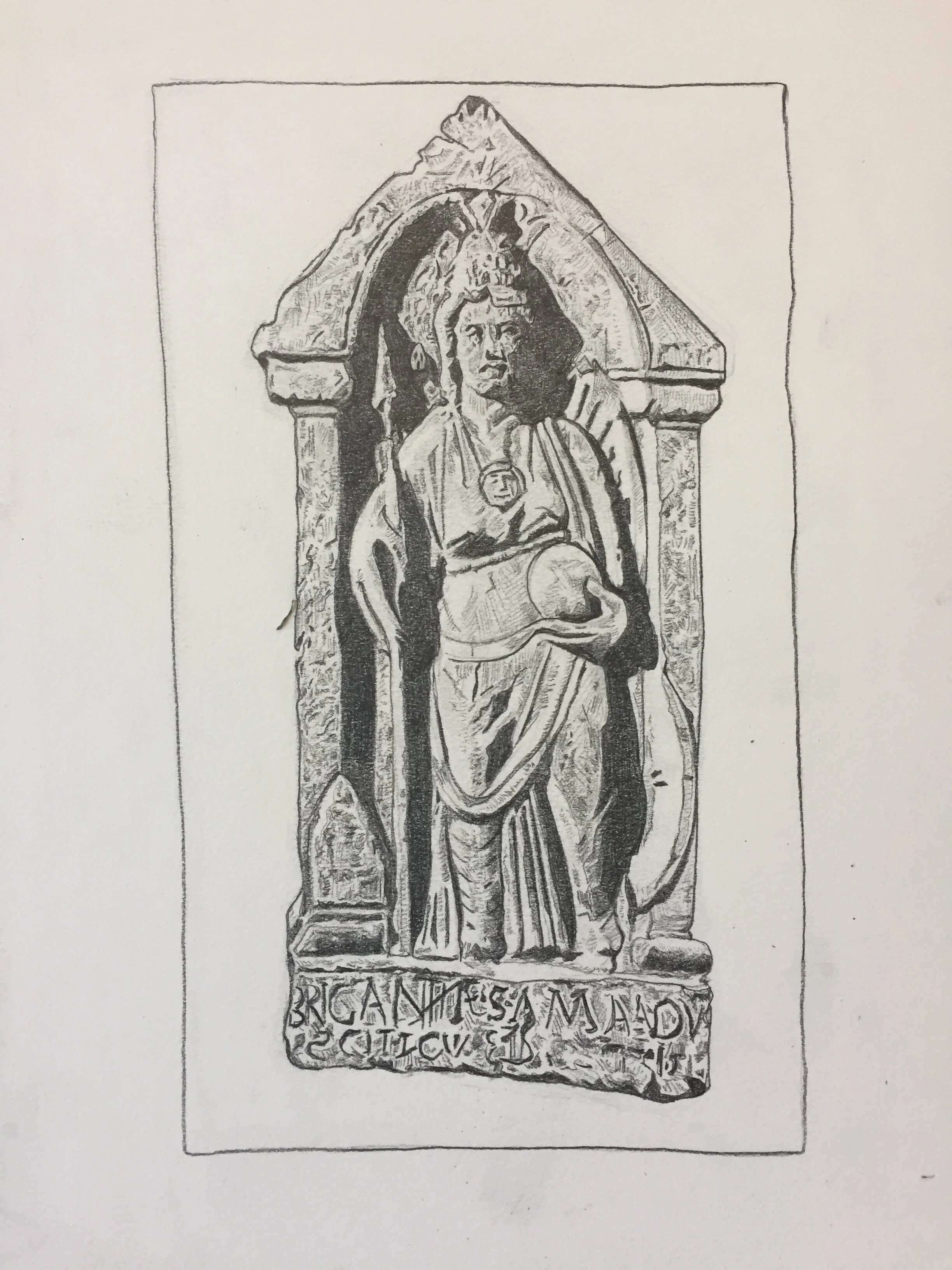
fig.2: Brigantia statue

fig.2: Brigantia statue

Starting a new project is always a massive comma. You’re ready to go, and excited, and then stumped. I mean – I’ve got an idea, a feeling of what I want to do, but actually starting, well that’s another matter. And this is where games, experiments, trying something completely different – all these things, come in. 

fig.2: Insus tombstone

fig.2: Insus tombstone

 My latest project is taking a scenario and creating a comic about The Romans. I’ve had the first meeting, talked over the scenario, the key bits of research that might be of use, and asked a load of stupid questions (I find asking as many of those is really useful to get a sense of what the brief is); but sitting down to start – nothing, flatline. 

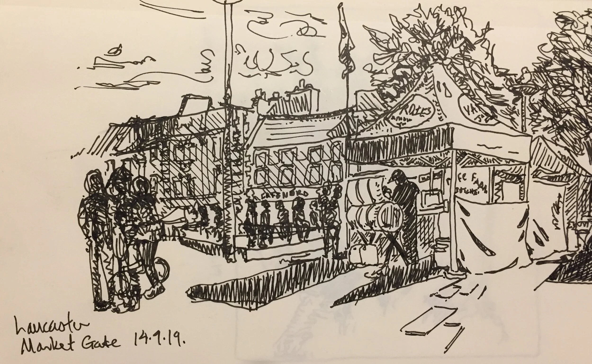
fig.3: Lancaster Market Square

fig.3: Lancaster Market Square

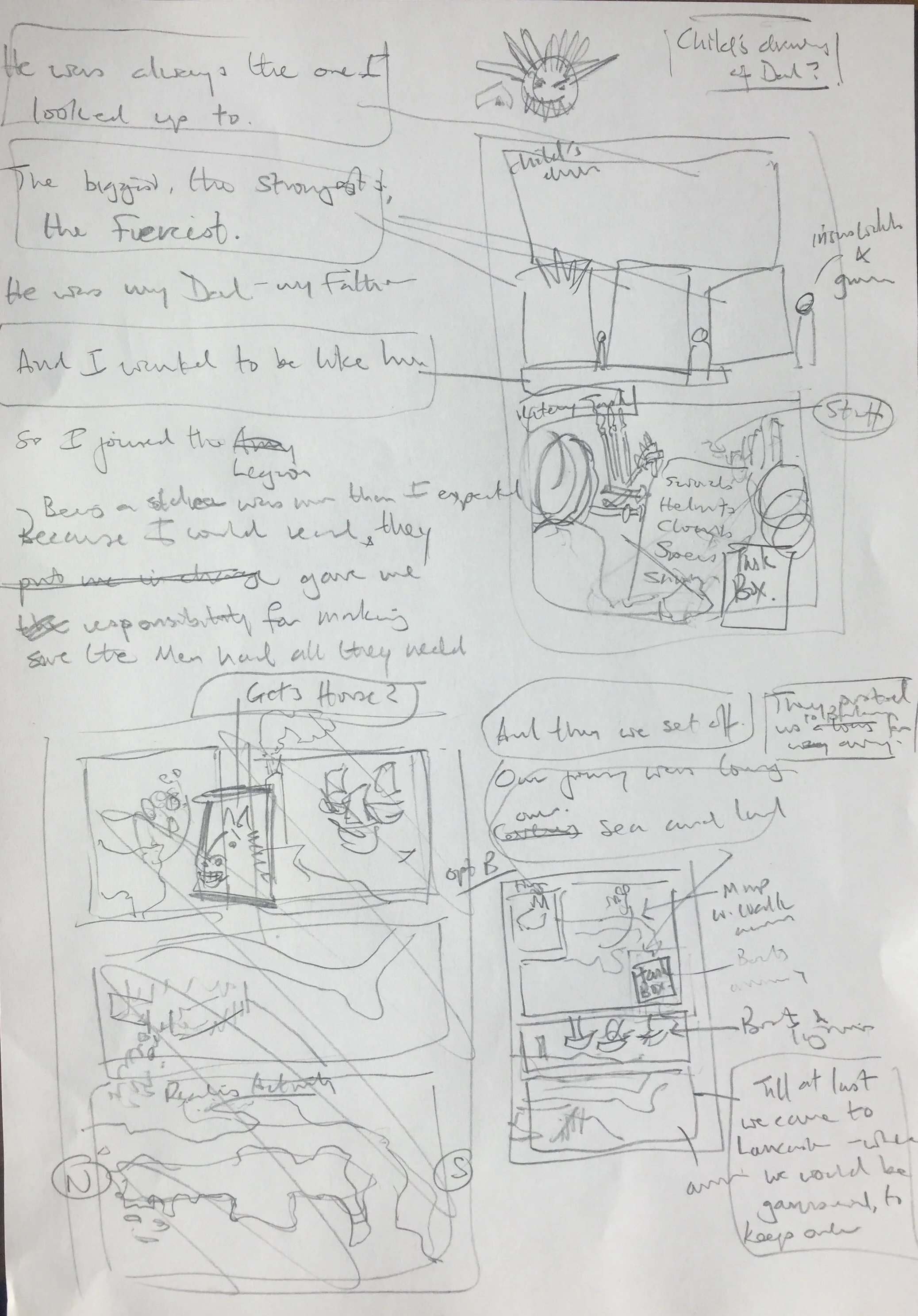
 At this point I generally get frustrated with myself. I stare, I think, I make coffee – and another; I pick up my pencil – then put it down and check some emails – catching myself I stop, have more coffee, then go for a walk. I mean I know I can write a script and plot a sequence of panels (what I call proto-thumbnails – loose compositional sketches to work out how the narrative will progress together with the images [fig.4]), but I can’t get past the white page that seems to be grinning at me. The danger is that the frustration can lead to giving up, or worse avoiding the issue – burying the project under a load of to-do lists sort-of-thing.

fig.4 Proto-thumbnails
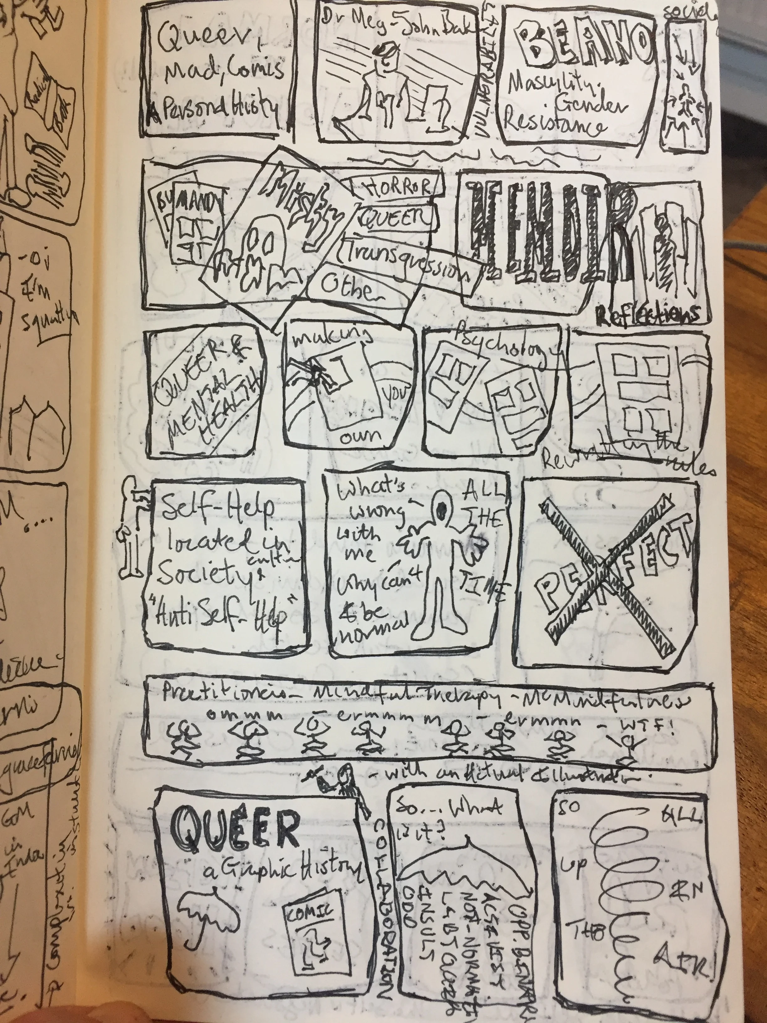
fig.4 Proto-thumbnails

My way in, is often through drawing – quite detailed drawing. In this case the recreation of research images, which force me to look fully, to arrange my thoughts with discipline, and to imbibe a sense of form and shape that will inform the format of the comic itself [fig.1].

Add to that a physical visit – researching more artefacts, walking the space to get a sense of the landscape and place, aided and abetted by the endorphins of movement, and the dissonance of the different. All of which provokes more drawing [fig.2 & 3] - some is specific, but some is about letting my imagination explore the space around the topic. Now my notes suddenly seem to make sense; and the white page begins to reveal a pathway into plot and story.

So, before I know it, the first draft is completed – alongside a load of new questions that will be answered as I start to draw the thumbnails proper. 

The water of life.

fig.1: Tomatoes

fig.1: Tomatoes

I haven’t worked in watercolour for a while, but recently I’ve found myself going back to it a couple of times. It’s a medium that seems spontaneous, but I find it makes me re-think the way I normally draw and paint. I have to re-see light and shadow, and really consider where not to paint. Colour builds in layers, and shades through diluting the pigment. Acknowledging absence is fundamental to the process.

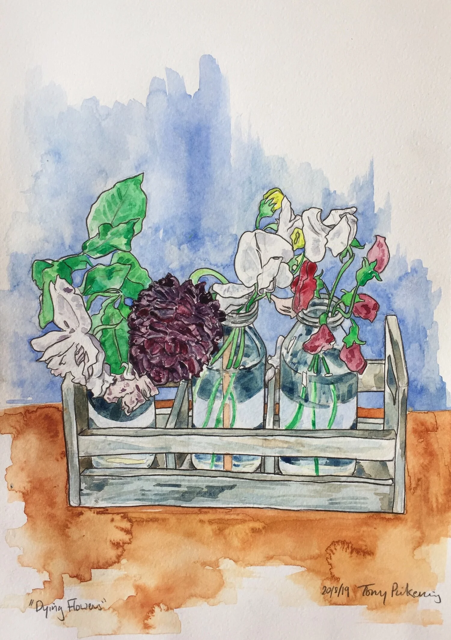
fig.2: Dying Flowers

fig.2: Dying Flowers

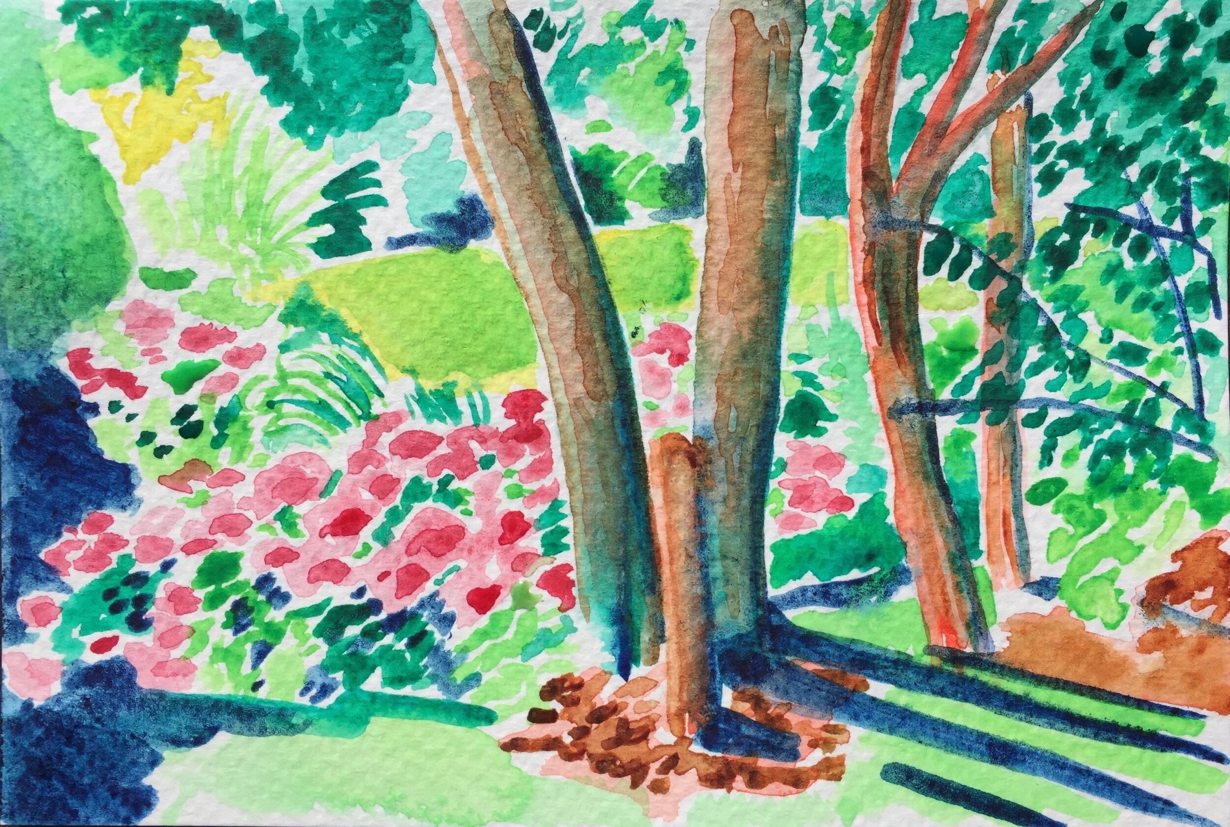
fig.3: Norfolk morning #1

fig.3: Norfolk morning #1

Maybe this is why I decided to use watercolours with my Dad [fig.1 & 2]. Re-thinking what I knew is part of my interaction with Dad and his dementia. Trying to understand him in the Now, whilst still holding him in my memories and who I am; using art to talk with him: something that doesn’t require context, doesn’t provoke distress, something that is present and visceral, that can be witnessed as a process, and be pleasurable in itself. 

I’ve touched on this in previous posts, and while it may seem egotistical, the moments when I look up and see him enjoying seeing me drawing or painting are moments when I see HIM for a second, and I feel he can see me – and not the person I have to become around him now. If I’m honest, drawing and painting allows me to process the situation too. My focus on an object or a scene, lets me put emotions that aren’t helpful into technical processes, and it turns out both of these paintings consider life, and the path of decay.

fig.4: Norfolk morning #2

fig.4: Norfolk morning #2

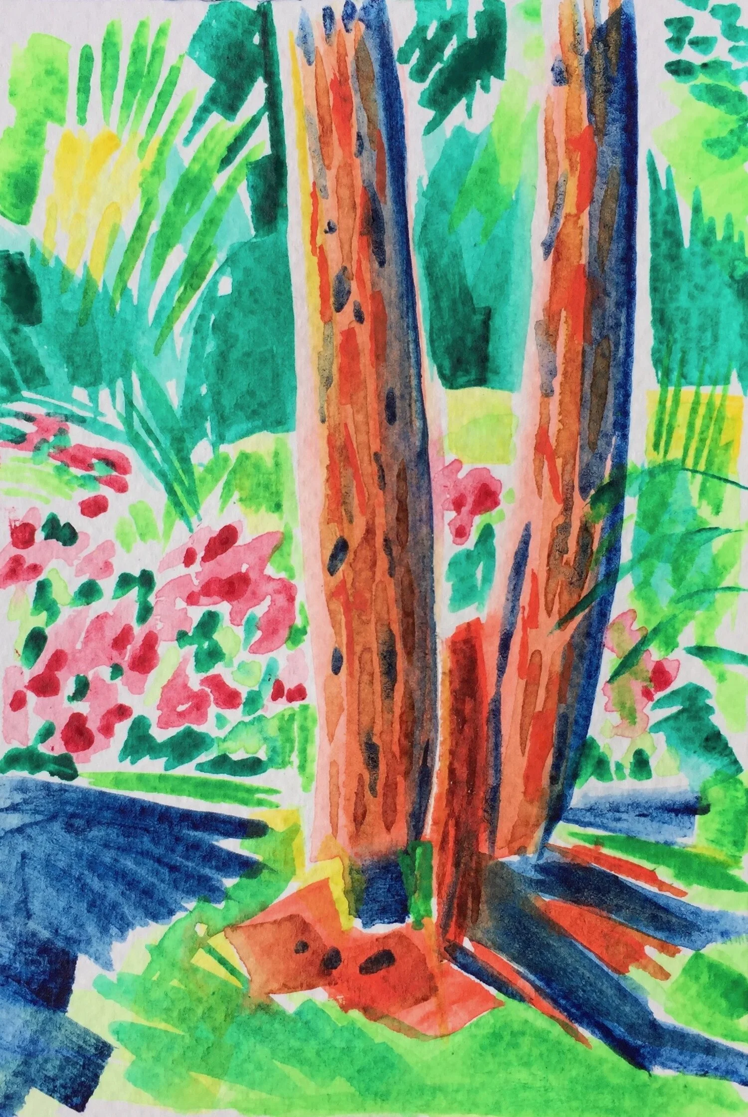
In contrast the other sketches [fig.3&4] consider pattern and line in blocks and try to catch the vibrance of holiday mornings, before people are up, before the tensions of the day begin. These are experiments with light and colour, about the beginning of the day, and the potential of life.

They are exercises about how to depict the world in new forms, with new limitations and solutions, and although a key part of describing line in the paintings is by filling the space around it, this absence is a positive statement, and together with blocks of colour, make Norfolk seem Mediterranean, which for a few moments, it was. 

Starting from very different places these images produce very different results. But each one impacts on my practice - provoking new ideas and pathways for approaching, and embracing projects in the future.

Stacking the Deck.

Right, I’m back, and the coffee has brewed, so let’s go. 

 After a bit of a break, and some time with my Dad, this week I want to reflect on some work I produced for a Card game – Carbon City Zero: “A deck-building card game where players race to create the first zero carbon city”, produced by Dr Sam Illingworth and Dr Paul Wake  at Manchester Metropolitan University and the charity 10:10 Climate Action.

Fig.1: Biogas Plant

Fig.1: Biogas Plant

Fig.2: Lobby Ministers

Fig.2: Lobby Ministers

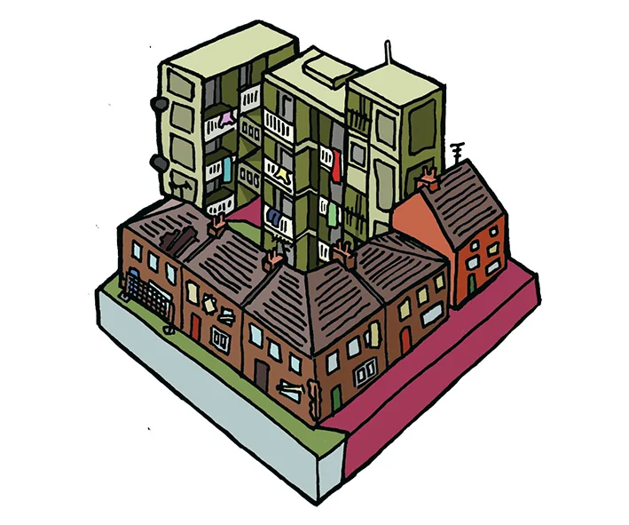
My brief was to produce illustrations for the cards – with three distinct sets of cards. The creators wanted the sense of building a city – so liked the idea of isometric tiles that felt as if they could fit together. They also liked the hand-drawn feel of the line in my Newcastle: City Tales sequence. The cards had to have the feel of a recognisable world, but also – given the aim of getting the players to make their city carbon neutral, as if the world was a place where good choices could be made [fig.1]. They also had to be objects that people wanted to engage with.

Right-ho then.

I researched isometric images, and realised the maths was going to be fun – especially as the images I came across often had a futuristic and computer-generated feel. Amazing as some of these images were, I quickly realised that my approach needed to be different. My solution was to cut a template – so I could repeat the maths quickly (a little trick I’ve picked up working out maths for food with my type 1 ;) ), this enabled me to work to a ratio, and perspective consistently - except where I wanted to cheat. 

Fig.3: Poor Housing Stock

Fig.3: Poor Housing Stock

With the framework set up I could get into the nitty-gritty. I soon began to enjoy realising the detail of the urban landscape [fig.2]. The drawings moved from the futuristic to the decaying, from technology to the human figure, from the high-rise to the everyday – in short the nuance and complexity of a modern city.

Fig.4: Behavioural Change

Fig.4: Behavioural Change

My initial pencil drawings were tonal – playing with depth and the perspective of the isometric base. Windows, doors, nooks and crannies, these all became part of the texture of the drawings. To keep the hand-drawn feel I resisted the temptation to trace the line in Illustrator – instead inking the pencils, scanning in the inks, and cleaning up any pixel distortion in Photoshop (I know this can be done quicker – and when I get an i-Pad we’ll talk *sigh). I simplified the drawings as I moved from pencil to inking the outlines but decided when I chose to add colour digitally that I wanted to reflect some of the tonal quality, so used tone as well as light and shadow to build my colouring [fig.3]. 

Fig.5: Poor Communication

Fig.5: Poor Communication

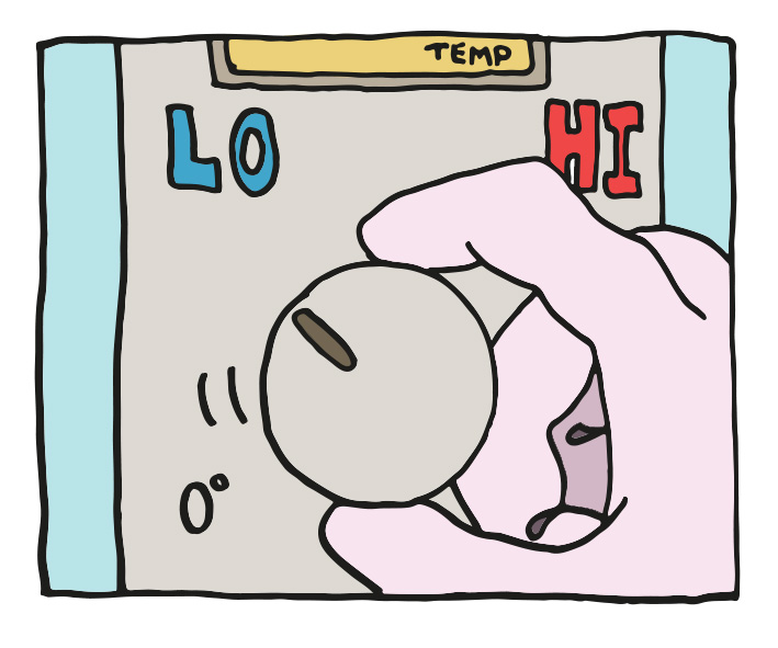
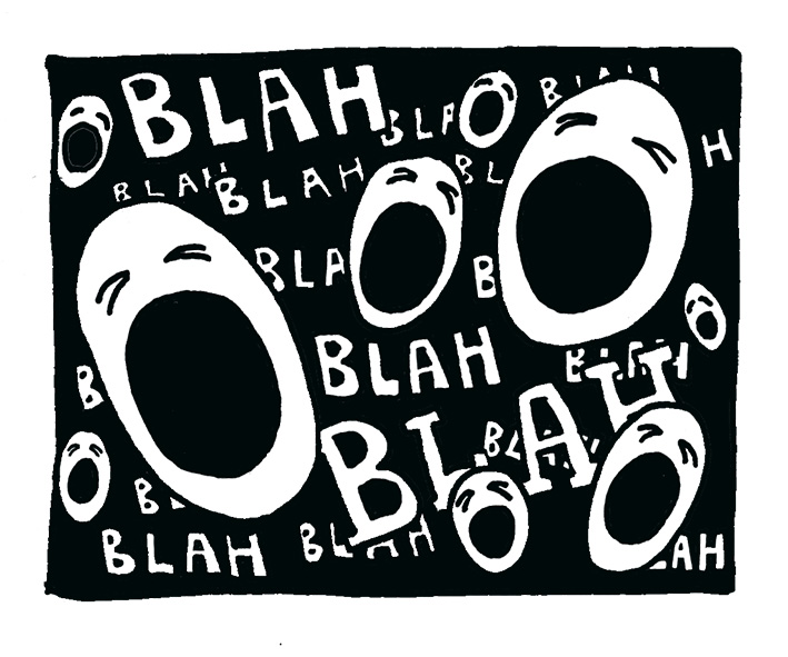
The other card sets had to have different qualities – some infographic, some bleaker, but they also had to feel a part of the game. These cards are more graphic [fig.4], and more cartoon [fig.5] – both deviations I enjoyed, playing with symbolic and satirical impulses, and the thought behind representing data and ideas. The link between the sets is in the line – or the tone of voice that speaks to the player, that starts the dialogue.

With 39 images, this was a large project, but one that was absorbing, challenging, rewarding, a project I’m proud to be a part of – Oh, and I quite like my drawings too ;) 

Surprised squirrel - work in progress.

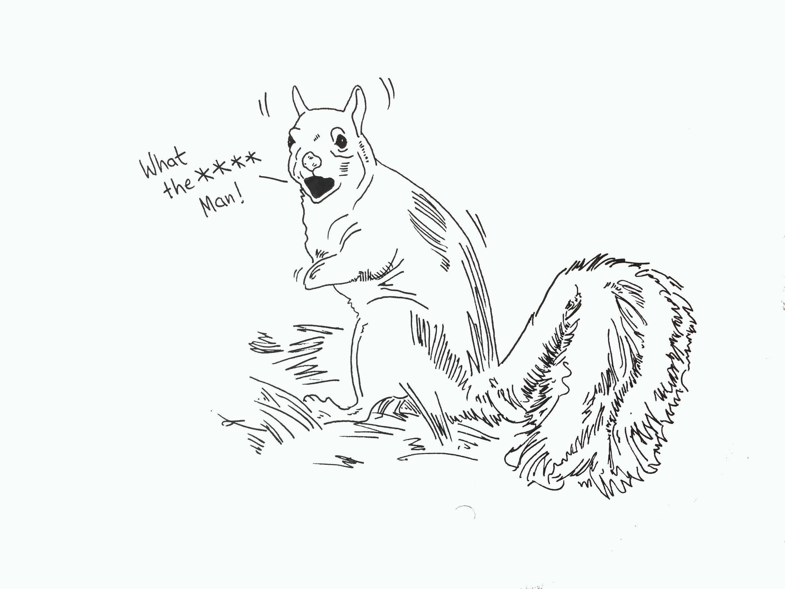
Just a quick - and very late post this week. Partly cos’ I’ve been busy, partly cos’ I’m away next week (so no post). One of the things I’ve been working on is a graphic story about my need to exercise, y’know for health, and my complex relationship with exercise - which is both to do with type 1, and probably more to do with the psychology of competition.

fig.1: Surprised squirrel (at the sight of me running)

fig.1: Surprised squirrel (at the sight of me running)

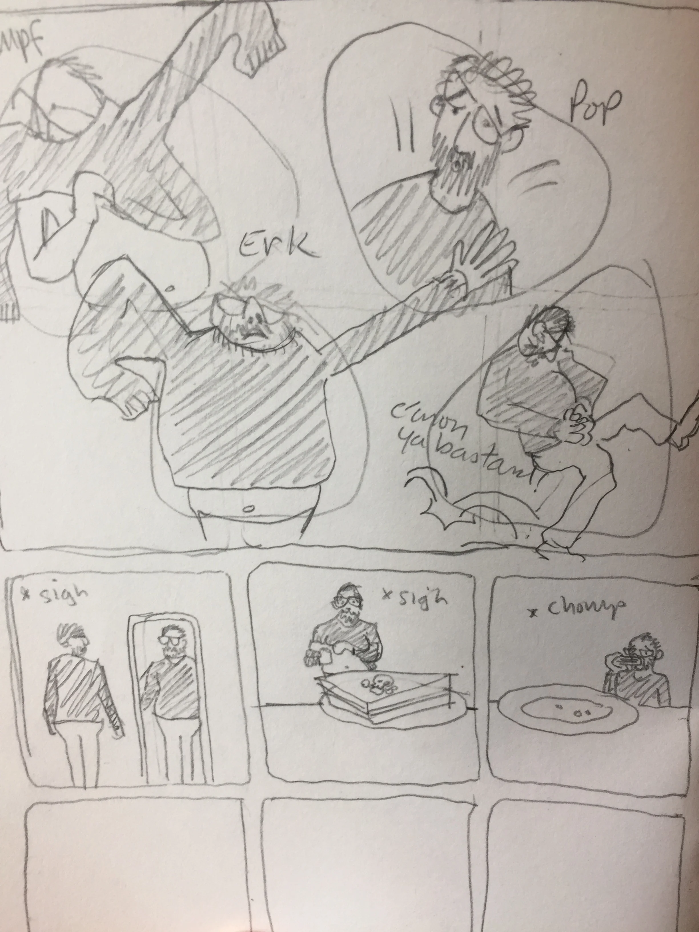
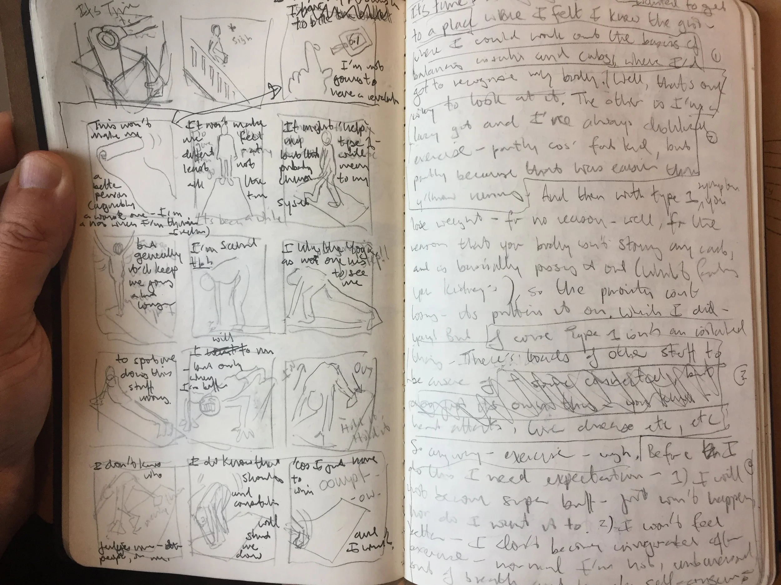
Anyway these are things I’m working out - which you can see below in some of my thumbnails and starting sketches [fig.2-4] - where I’m beginning to establish the relationship between image and text. In these rough sketches trying to establish a pattern of physicality and movement through line, shape and the frame.

fig.2: Draft sketches - opening sequence

fig.2: Draft sketches - opening sequence

But more importantly, whilst running this morning, the sight of me had this effect on a squirrel [fig.1], which will probably make it into the final piece… so there’s that.

fig.3: thumbnails and text

fig.3: thumbnails and text

fig.4: Sequencing plans

fig.4: Sequencing plans

Imaginative space

I guess this week’s post is a process piece, but I’m not sure I’d call it a systematic approach? I’ve got a few projects zooming round my head – some professional, some personal, and some domestic. The upshot being that the brain can get cluttered, creativity can seem a chore and motivation can dip - which is where these drawings come in... It also helped that I’ve managed to get out to a couple of gallery spaces this week. 

 These drawings are of work by other artists. They offer an imaginative space in which to play – a space which is constructed by logic other than my own so has a different pressure to work with and within. 

fig.1: Roger Hirons “Untitled”

fig.1: Roger Hirons “Untitled”

 Roger Hirons “Untitled” [fig.1] in The Yorkshire Sculpture Park takes the form of two decommissioned Boeing EC-153c aircraft engines and drew me in for many reasons: the sight of these very mechanical objects in the grounds of the park; the detail of the mechanics evident in the construction, as well as the effect of decay in tone and texture; the fact that the engines remind me of the pod racers in the Star Wars prequels (not gonna say much more about those – but the pod-racing was cool); and the play of light and shadow on the hottest day of the year made for a nice composition. 

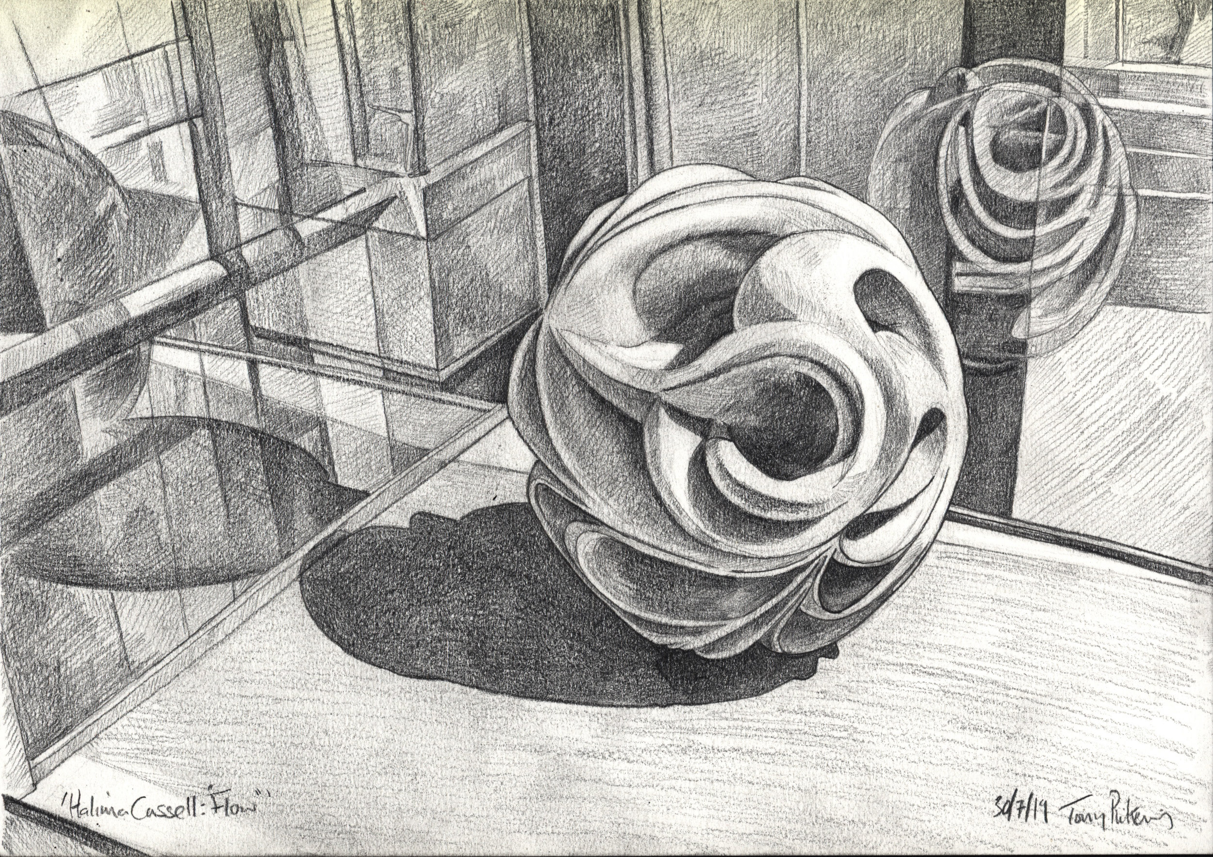
fig.2: Halima Cassell’s “Flow”

fig.2: Halima Cassell’s “Flow”

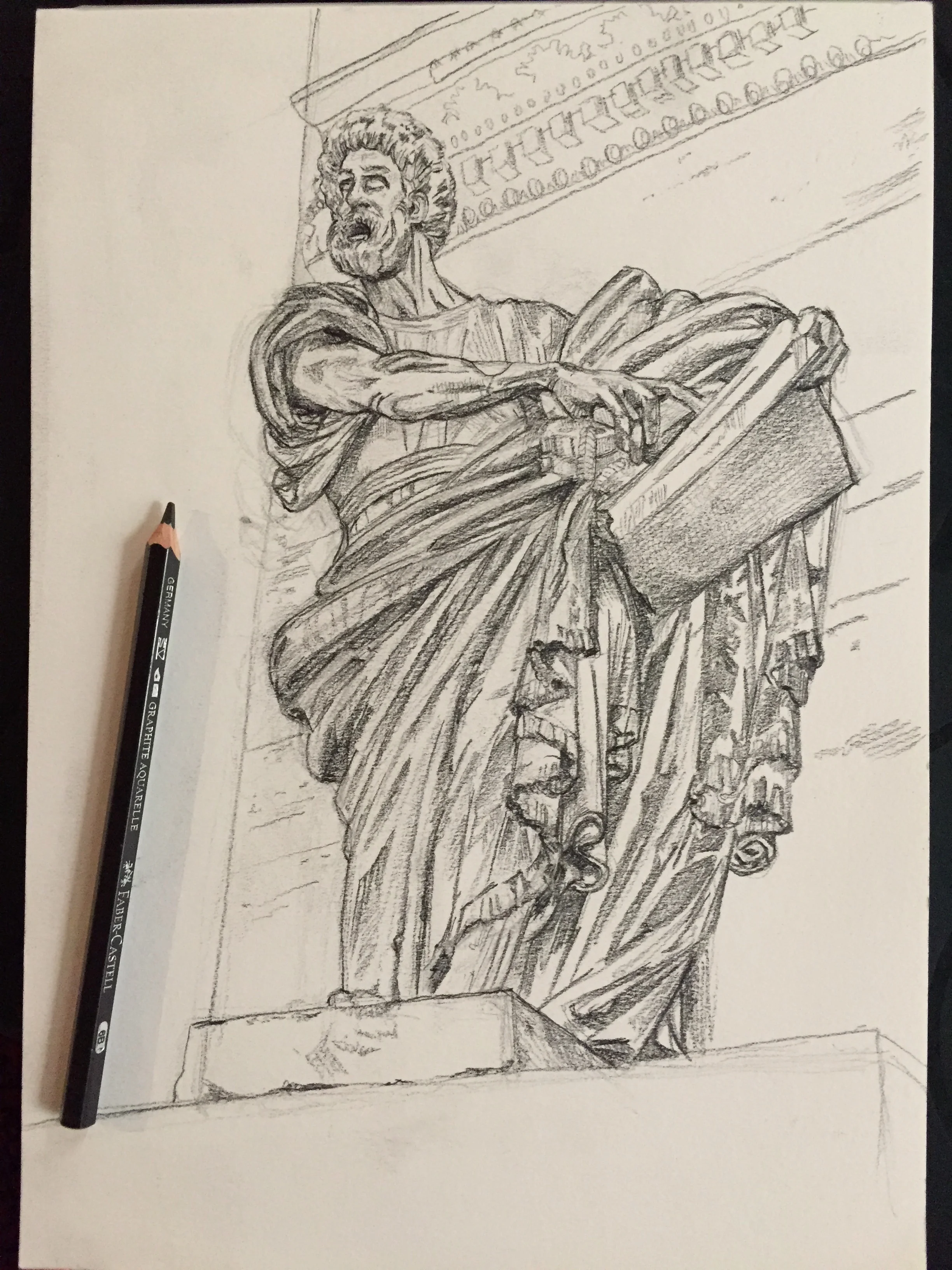
fig.3: “St Peter” by Mochi

fig.3: “St Peter” by Mochi

 Halima Cassell’s “Flow” [fig.2] in the Manchester Art Gallery is part of an exhibition I was returning to – having only had a brief chance to gawp the first time. Here the complexity of her sculptures and ceramics produces shapes I found myself mesmerised by; and the reflections in the case provoked ways to explore a shape that by definition seeks to hide from the viewer. 

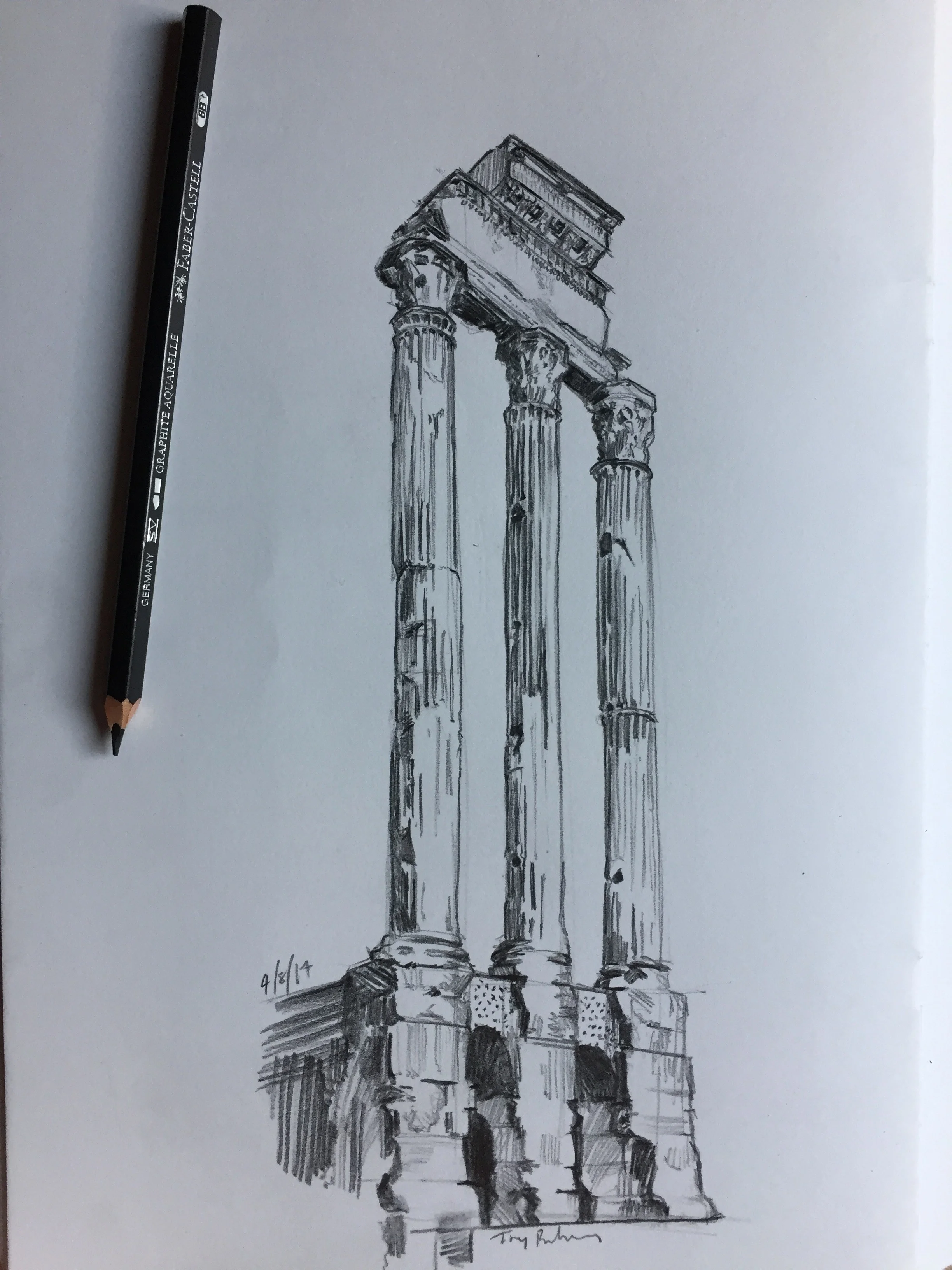
fig.3: “The Temple of Castor and Pollux”

fig.3: “The Temple of Castor and Pollux”

 Lastly are two drawings from a trip to Italy: “St Peter” by Mochi [fig.3] found guarding the Porto del Poppolo in Rome (full disclosure – I think that’s the right attribution, but I could be wrong) – I just loved the expression and characterisation; and “The Temple of Castor and Pollux” [fig.4] from the Forum for its drama and scale.

 Importantly these are drawings of sculptures (*ahem, mostly), bringing the three-dimensional challenges of form, shape, and depth to my drawings. Allowing me to play with shadow, tone, light and reflection and line. They are also detailed – drawings that prompt me to lose myself in the experience of drawing, in the tactile pleasure of blending and building up layers of graphite on paper. 

 The images are both challenging and zen – focusing my concentration on specific images, whilst simultaneously allowing latent ideas and plans to surface and unclench, letting them spread out from the ball which overthinking had wound them into.

Face values

Another quick blog I’m afraid. This week I have my graduation ceremony for my Illustration MFA (completed with distinction last October - yay! - but this week I get to wear the hat and robe 😉), so I’m writing between work bits n bobs, sorting all that and a bit of celebration.

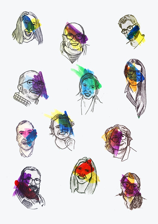
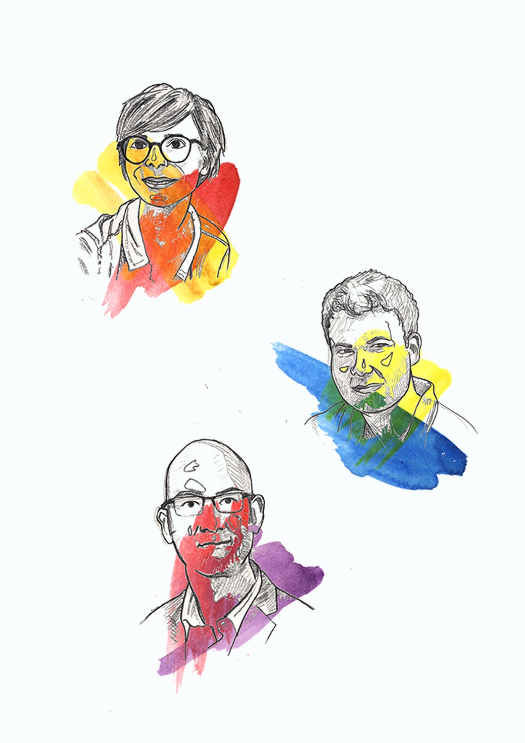
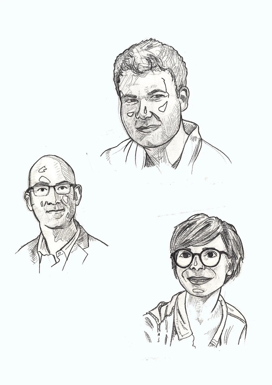
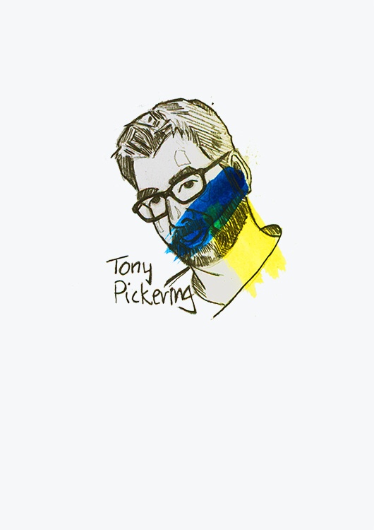
So this week I’m looking at some commissioned work - staff identities for a website, St Giles Medical (a medical communications company based in London and Berlin) [fig.1 & 2], which to me are celebratory.

Fig.1 “meet the team”

Fig.1 “meet the team”

I loved doing these as they combine pencil drawings [fig.3], portraiture, cartooning and colour design (there’s also lettering which I’ve not included here - except fig.4), and each step has its own joy for me in the process.

Fig.2 “meet the team” (Additions)

Fig.2 “meet the team” (Additions)

These images have a nice tension for me - between realistic depiction and a stylised line that want more simplicity. There’s also something really cool about the way the pencil works with and against the colour - which is first gouache, then digitised as the drawing and image is refined.

Fig.3 “meet the team” Pencils

Fig.3 “meet the team” Pencils

At all stages there are challenges of depiction, of tone and colour and of composition - for the individual images, and how they can work together.

Fig.4 “meet the team” (individual and lettering)
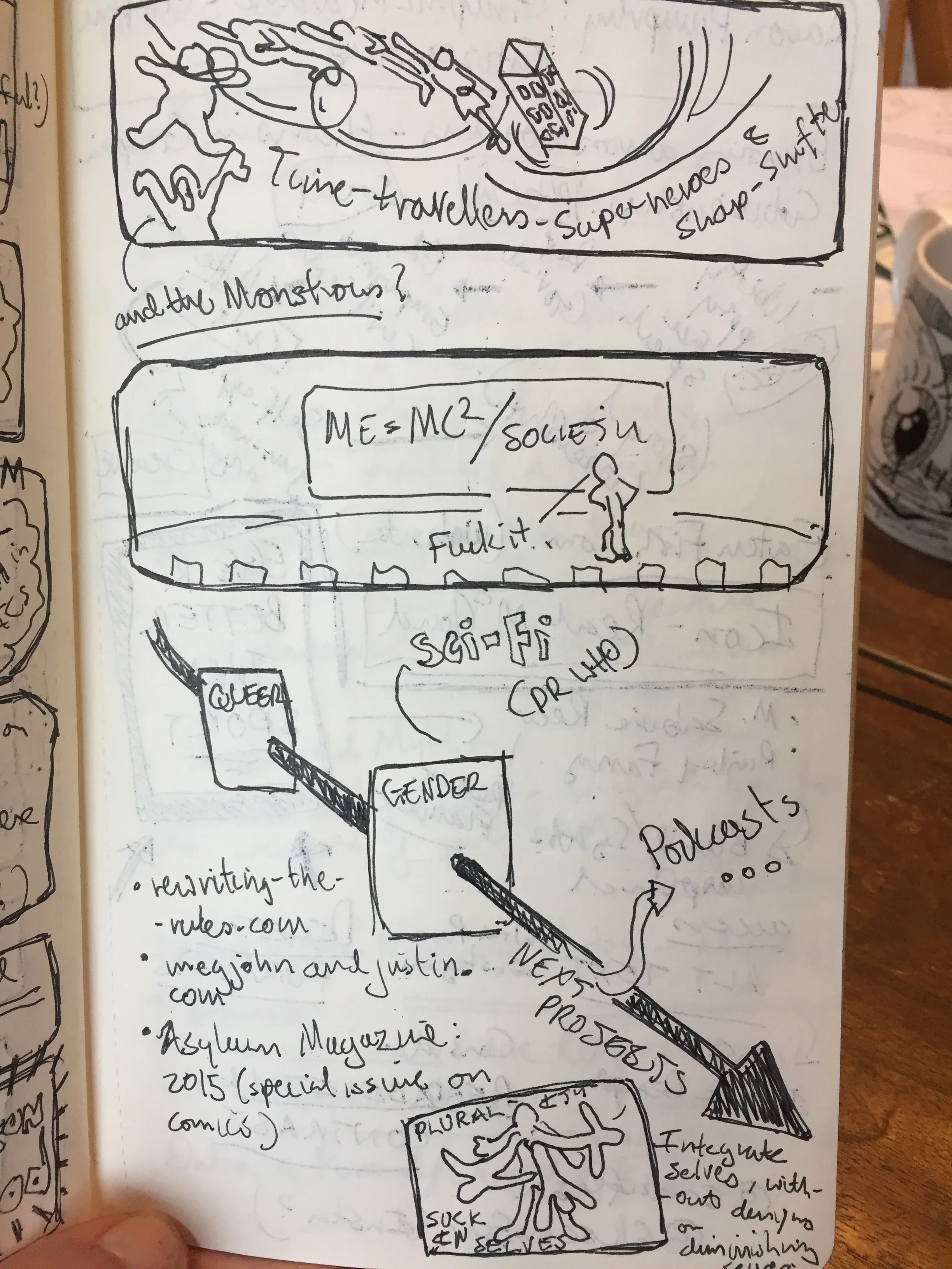
Fig.4 “meet the team” (individual and lettering)

But ultimately, what I enjoy is the task of finding the personal in the professional and reminding myself how humanity is central to my illustrations and design.

Some welcome Graphic Medicine.

The sun had set, the moon luminescent in the sky – light flickering on the lapping waves. Heat and Summer stretched along the Brighton seafront – as back towards the centre Saturday night sprawled onto the shore.

Watching the dancing light, I felt a curious mixture of elation and exhaustion. The last three days of the Graphic Medicine 2019 conference had been an adventure: with so many people to see and speak to; new perspectives to consider and new work to appreciate – and wow to; as well as the small matter of my own presentation to prepare and deliver. After all that those dancing lights seemed to slip between inspiration and delirium. 

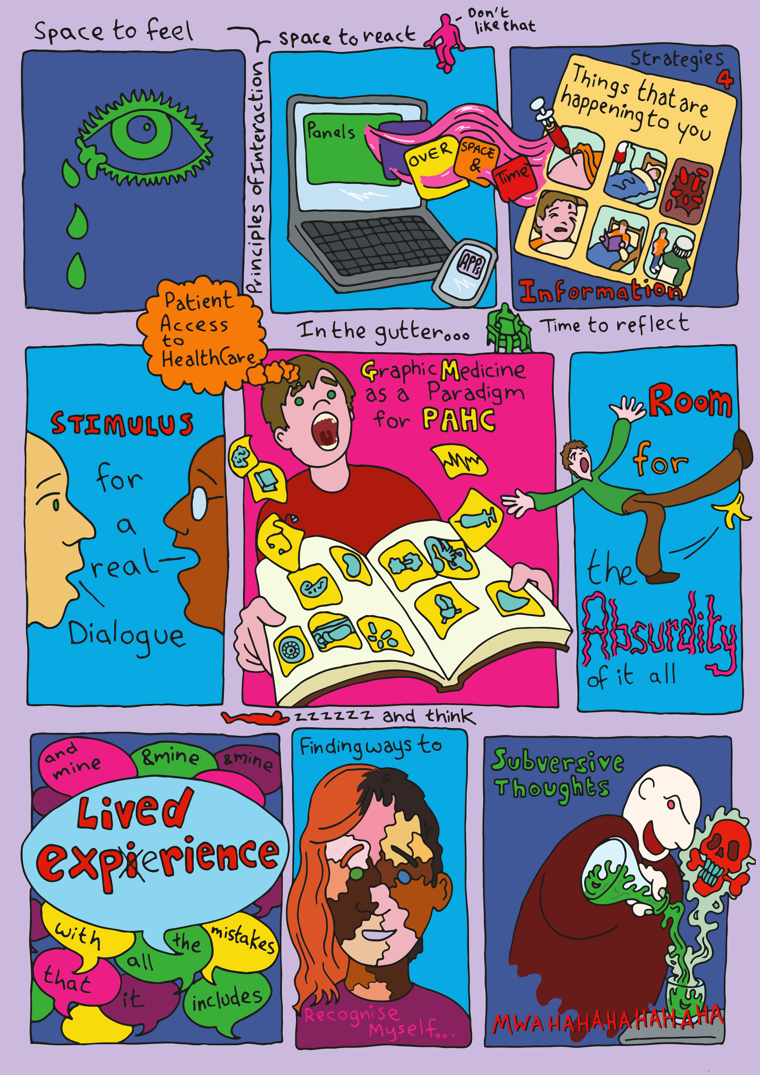
fig.2 Graphic Medicine as a paradigm for PAHC

fig.2 Graphic Medicine as a paradigm for PAHC

fig.1a: Meg-John Barker: Queer: A Graphic History (comics notes)

fig.1a: Meg-John Barker: Queer: A Graphic History (comics notes)

The theme of this year’s conference was Que[e]rying Graphic Medicineand kicked off with a keynote by Dr Meg-John Barker that looked at “queering” as a deconstruction of the simplicity of binary relationships in psychology and explored the notion of the many selves we are and act throughout our lives. Their speech spoke to my belief in the importance of communicating and engaging with complexity in the conversation between Healthcare Institutions, Professionals and People Accessing Healthcare; a belief that got me into graphic medicine in the first place [fig.2 are my comics notes of her keynote[1]].  

fig.1b: Meg-John Barker: Queer: A Graphic History (comics notes)

fig.1b: Meg-John Barker: Queer: A Graphic History (comics notes)

The breadth of the conferences took me from panel to workshop to conversation then further conversation over drinks. My snapshot covered comics that started conversations, that articulated multitudes of selves, that engaged with the lived experience of healthcare workers, carers and people living with illness[2]; presentations questioned our assumptions of form, value and benefit and sought to find ways to make plurality accessible – immediately and digitally[3]; workshops explored ways to allow access to aesthetic discovery and consider our models of healthcare[4], and all through this I saw comics that were beautiful, poignant, absurd – but mostly honest[5]. Presenters navigated the complexity of telling their own stories and how to express the stories of others[6], artists questioned and illuminated their own processes – and considered how the visual language of others could be re-purposed to allow themselves to say something they might otherwise keep hidden[7]. The final keynote was MK Czerwiec’s account of Coming Out as a Cartoonist, and the heartbreak and joy that fuels Taking Turns her memoir of the experience as a Nurse in Unit 371, an Aids unit at Illinois Masonic Medical Center in Chicago, that ran from 1984 to 2000. All of which was summed up by Matthew Noe – taking a break from live tweeting everything!

fig.1c: Meg-John Barker: Queer: A Graphic History (comics notes)

fig.1c: Meg-John Barker: Queer: A Graphic History (comics notes)

I couldn’t see all the panels, nor can I cover all I saw – so my apologies now to anyone I’ve missed out. For myself, the conference allowed me to speak on Diabetes: Year One – my impulses towards poetry and comics, and the articulation of comics as a research methodology. To discuss the process of discovery in the movement from being a person, then a patient, and then a person living with diabetes, and then, maybe in the future, a person who has diabetes. My talk led me to draw (a good sign I feel), to attempt to describe the way the comics has brought me to see comics as a paradigm for Person Access to HealthCare (PAHC – and yes the illustration was added last minute – hence my mistake of writing “patient” instead of ‘person’ in the orange bubble, go-on look, told you) – as a model for UX design, if you will [fig.1]. The idea is to realise that it is the person in the spaces between that gets to construct the meanings between the panels of information and experience, so instead of leaving the gutter as an after-thought, maybe design with the gutter space as the focal point?

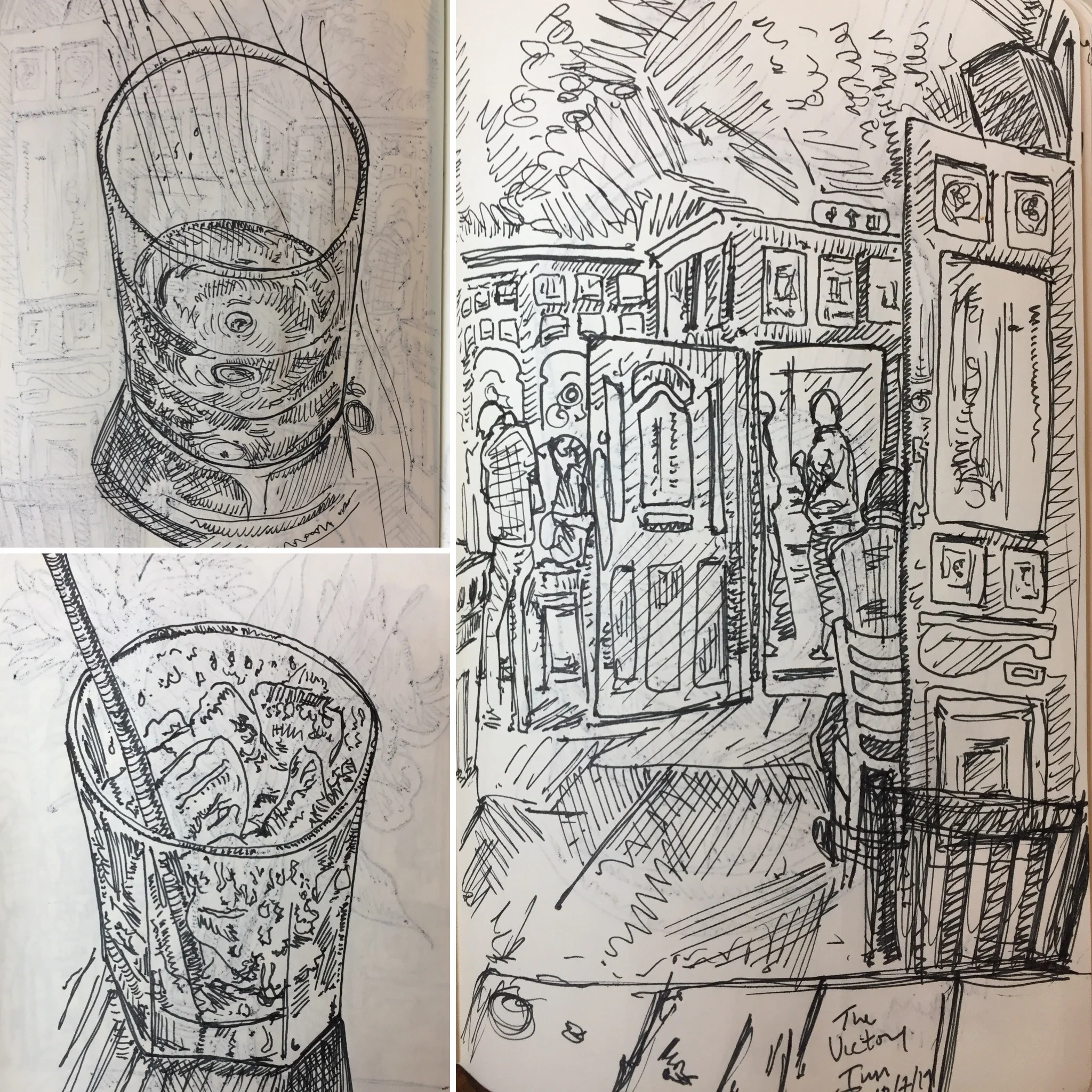
fig 3. Brighton: Pubs n Drinks

fig 3. Brighton: Pubs n Drinks

As well as all this, I got to talk out ideas for another comic project (no pics – the thumbnails are waaay to rough and over-written after getting too excited), drink way too much and explore some of Brighton’s pubs [fig.3]… and sights *coughs. Which might explain why the blog is late this week.

To conclude it was a phenomenal conference and a huge thanks needs to go to the organising committee: Bobbie Farsides, Ian Williams and Muna Al-Jawad, and I hope to make it again next year – in Toronto.


[1]Meg-John Barker: Queer: A Graphic History

[2]Wilkins, Caron, Grennan, Priego, Rana & Roper: On the Aesthetic Education of Caregivers: The Specificities of Form and Genre in Comics about Dementia Care; McNicol & Leamy: “He’s got a tongue, you know!”: Creating a comic with people with Dementia 

[3]Christina Maria Koch: Talking about Illness Experience in Graphic Medicine – Theory, Method, Politics; Alice Jaggers: Definitions without Borders: How to Define Graphic Medicine While Being Inclusive; Sam Schäfer: There is More to Comics and Blindness than Daredevil

[4]Councillor, Fox & Fryzelka: Drawing new paradigms of health and care

[5]Loads of these – but especially Zara Slattery: Coma Comic (work in progress – watch out for this!)

[6]Adam Bessie: It’s All In Our Head: Graphic Memoir in Collaboration; Viivi Rintanen: Comics about Madness – how to reduce the stigma of madness with a comics blog

[7]John Miers: Processing my own trauma through the voices of others.